
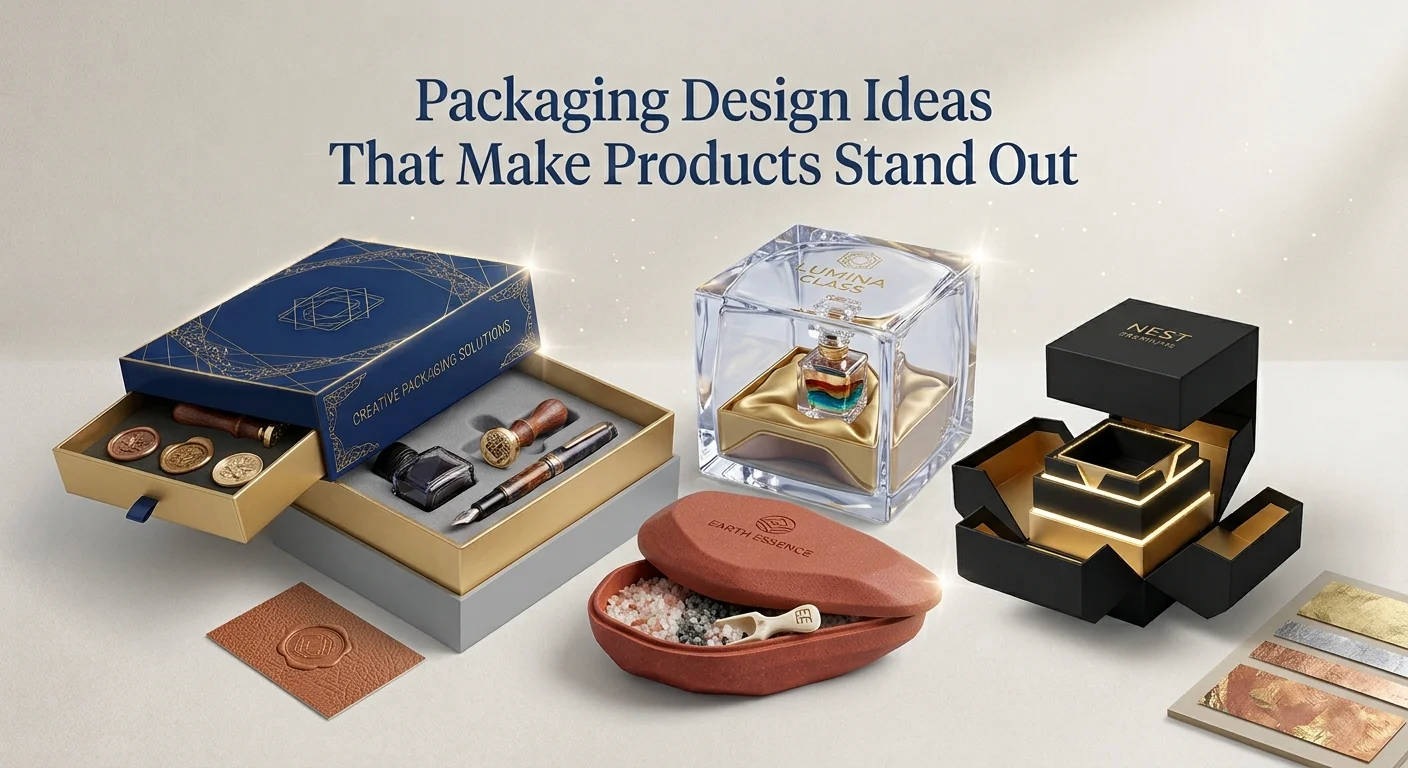
A product can be excellent, but customers often notice its packaging before they discover what is inside. A thoughtful package can create curiosity, communicate the brand, and make an ordinary product feel more memorable.
The best packaging design ideas are not simply about making a box look attractive. They combine visual identity, practicality, product information, and the experience a customer gets when opening or holding the package.
Whether you are launching a new product or refreshing an existing brand, these ideas can help you create packaging that feels intentional and recognizable.
What Makes Packaging Design Stand Out?
Standout packaging usually has a clear reason behind every visual element.

The color, typography, imagery, structure, and message should work together instead of competing for attention.
A strong design often has these qualities:
- Easy to recognize
- Appropriate for the product
- Consistent with the brand
- Visually distinctive
- Simple to understand
- Practical to use
- Suitable for its target customer
The goal is not to make packaging as complicated as possible. Sometimes one memorable idea can have a stronger impact than several decorative elements.
1. Build the Design Around One Strong Visual Idea
One of the easiest ways to make packaging memorable is to give it a central visual concept.
Instead of filling the package with patterns, illustrations, and text, choose one element that immediately communicates the product or brand.
For example, a tea company could build its packaging around botanical illustrations. A skincare brand might use a simple geometric symbol across its entire product range.
The central idea becomes something customers can recognize even before reading the brand name.
2. Use Color to Create Instant Recognition
Color can become one of the strongest visual identifiers for a product.
A brand does not necessarily need several colors. A carefully selected combination can be more effective.
Consider using:
- One dominant brand color
- A contrasting accent
- Neutral background tones
- Different shades for product variations
For example, a food brand could maintain the same package layout while changing one accent color for each flavor.
This creates consistency while helping customers distinguish products quickly.
3. Try a Minimalist Packaging Layout
Minimalism can make packaging feel modern and confident.
Instead of adding information everywhere, give the important elements enough space to breathe.
A minimalist package might include:
Brand name → Product name → One visual element → Essential information
This approach can work particularly well for cosmetics, skincare, candles, stationery, technology products, and premium goods.
Minimal does not mean empty. It means removing elements that do not contribute to the message.
4. Make Typography Part of the Identity
Typography can completely change how packaging feels.
A bold typeface can make a product appear energetic, while a refined serif font can create a more traditional or premium impression.
Think about:
- Font personality
- Readability
- Hierarchy
- Font combinations
- Letter spacing
- Text size
Avoid using too many typefaces on the same package. Two complementary fonts are often enough to create distinction between headings and supporting information.
5. Create a Packaging System for the Whole Product Range
If a brand sells several products, each package does not need to look completely different.
Instead, create a visual system.
Keep elements such as:
- Logo placement
- Typography
- Box structure
- Main layout
- Brand colors
consistent across the range.
Then change selected elements such as flavor, scent, size, or product color.
This makes the entire collection look like it belongs to one brand.
6. Use Illustrations Instead of Generic Stock Images
Original illustrations can give packaging a personality that generic photography often cannot.
Illustrations can be:
- Hand-drawn
- Geometric
- Botanical
- Technical
- Abstract
- Character-based
The illustration style should match the product.
For example, a natural soap brand could use botanical artwork, while a children’s product could use playful characters.
The important part is creating a visual language that customers can associate with the brand.
7. Experiment With Unexpected Color Combinations
Packaging does not always have to follow the safest color choices in a category.
Sometimes an unexpected combination can help a product stand apart on a crowded shelf.
For example, a category dominated by white and pastel packaging could use a deeper contrasting palette while maintaining a professional appearance.
Before choosing unusual colors, consider where the product will be displayed and what competing products look like.
Standing out works best when the difference is intentional rather than random.
8. Design the Inside of the Package Too
The outside of a package gets attention, but the inside can create the memorable moment.
Once the customer opens the box, consider adding:
- A short brand message
- A printed pattern
- A thank-you note
- Product instructions
- A simple illustration
- A reusable message or idea
The inside does not need to be expensive.
A small detail can make the opening experience feel more considered.
9. Turn the Product Box Into a Reusable Item
One creative approach is to give the packaging a second purpose.
A rigid box could become a storage container. A beautifully designed tin could be reused after the product is finished. A sturdy drawer-style package could become an organizer.
This gives customers a reason to keep the packaging instead of immediately throwing it away.
It can also extend the life of the brand’s visual identity inside the customer’s home.
10. Use Shape to Make Packaging More Recognizable
Packaging design is not limited to graphics.
The physical shape of the package can become part of the brand experience.
Possible approaches include:
- Unusual box proportions
- Sleeve-and-tray structures
- Drawer-style boxes
- Window packaging
- Curved elements
- Custom die-cut shapes
The structure should still protect the product and work with manufacturing requirements.
A unique shape is valuable when it supports the product rather than making the package difficult to use.
11. Let the Product Show Through a Window
A window can be useful when the actual product is visually appealing.
Customers may want to see:
- Product color
- Shape
- Texture
- Quantity
- Arrangement
Window packaging can work especially well for food, handmade products, gifts, cosmetics, candles, and small retail items.
The window should be positioned carefully so it becomes part of the overall design rather than simply leaving an empty area on the box.
12. Use Texture to Add a Physical Dimension
A customer does not experience packaging only through sight.
Texture can make a package feel different when it is held.
Depending on the design, brands can explore:
- Embossed details
- Debossed logos
- Textured paper
- Soft-touch surfaces
- Raised patterns
- Uncoated natural materials
These details can be especially useful for premium products where the physical feel contributes to perceived quality.
13. Tell a Short Story Through the Packaging
Packaging can communicate where a product comes from, what inspired it, or why it exists.
The story does not need to be a full paragraph.
A short statement, illustration, timeline, or visual sequence may be enough.
For example, a coffee brand could show the journey from coffee farm to roasted beans. A handmade skincare brand could explain the inspiration behind its ingredients.
Storytelling works best when it adds genuine information rather than marketing filler.
14. Create Designs That Photograph Well
Modern packaging often appears online before customers ever see it in a physical store.
Customers may photograph products for:
- Social media
- Product reviews
- Unboxing videos
- Blog posts
- Online stores
Think about how the packaging will look in a photograph.
A distinctive color, interesting inside print, recognizable logo placement, or unusual opening mechanism can create content naturally.
This makes the package part of the product’s online presence.
15. Add a Small Interactive Element
Interactive packaging can encourage customers to spend more time with the product.
Ideas include:
- QR codes
- Hidden messages
- Pull-out sections
- Foldable elements
- Simple games
- Product stories
- Scannable instructions
A QR code could lead to a recipe, product tutorial, playlist, authenticity page, or brand story.
The interaction should have a clear purpose. Adding a QR code simply because it is trendy does not automatically improve the packaging.
16. Design Packaging Around the Unboxing Sequence
Think about what the customer sees first, second, and third.
For example:
Outer package → Brand reveal → Product reveal → Message → Product information
Each stage can contribute something different.
A simple outer box followed by a beautifully printed interior can create a stronger experience than covering every surface with graphics.
This approach is particularly useful for direct-to-consumer and gift products.
17. Use Different Designs for Different Product Variations
A brand can maintain a consistent identity while giving individual products their own visual personality.
For example:
- Lavender → purple accent
- Citrus → orange accent
- Mint → green accent
- Vanilla → warm neutral accent
The layout remains recognizable, while customers can identify the specific product quickly.
This works well for candles, cosmetics, beverages, food, skincare, and other product ranges with multiple variants.
18. Make Sustainability Visible Through Design
Sustainable packaging does not have to look plain.
Natural textures, restrained printing, recycled-paper aesthetics, and simple structural designs can communicate an environmentally conscious approach.
However, avoid making unsupported environmental claims.
If packaging is recyclable, reusable, or made with recycled content, provide accurate information rather than using vague terms such as “100% green.”
Good sustainable design combines responsible material choices with clear communication.
19. Design for the Shelf and the Screen
A successful package may need to work in two environments.
On a physical shelf
It should:
- Be recognizable from a distance
- Have clear product identification
- Stand apart from competitors
- Communicate important information quickly
On an online product page
It should:
- Look clear in product photography
- Show the brand identity
- Remain recognizable as a thumbnail
- Work well in unboxing content
Designing for both environments can help brands maintain a consistent customer experience.
20. Give Small Details a Purpose
Sometimes the most memorable packaging comes from details that customers discover gradually.
For example, you could place:
- A small message under the lid
- A hidden pattern inside the box
- A short product story
- A playful instruction
- A unique opening tab
- A printed interior color
These details do not need to dominate the design.
They simply give the customer something extra to discover.
Packaging Design Ideas for Small Businesses
Small businesses do not need an enormous packaging budget to create distinctive designs.
Start with the elements customers notice most:
- A recognizable logo
- A consistent color palette
- Clear product naming
- One memorable visual element
- Quality material
- A thoughtful opening experience
Instead of paying for every available finishing technique, invest in one or two details that reinforce the brand.
A simple kraft box with strong typography and a distinctive sticker can sometimes look more intentional than an expensive package overloaded with effects.
Packaging Design Ideas for Premium Products
Premium packaging usually benefits from restraint.
Instead of adding multiple decorative elements, consider combining:
- A refined color palette
- High-quality materials
- Strong typography
- Minimal graphics
- Subtle texture
- Foil details
- A structured opening experience
The purpose is to make the customer feel that the package has been designed specifically for the product.
How to Choose the Right Packaging Design
Before finalizing a concept, answer these questions:
Who is the customer?
A package designed for children should communicate differently from one designed for luxury consumers.
Where will it be sold?
Retail shelves, online stores, boutiques, subscription services, and gift shops create different design requirements.
What should customers notice first?
Choose one primary message. It could be the brand, product name, flavor, scent, or another important feature.
How will the package be opened?
The opening experience should be convenient and intentional.
What is the production budget?
A beautiful concept is only useful if it can be produced consistently within the available budget.
Can the design work across multiple products?
If you plan to expand your product range, build a flexible visual system instead of designing only one package.
Common Packaging Design Mistakes
Even attractive packaging can fail when the design is not practical.
Too Much Information
Customers should not have to search through decorative elements to find the product name or important details.
Weak Visual Hierarchy
If every element looks equally important, nothing receives enough attention.
Copying Competitors
Similar colors or layouts can make a new product look like another brand.
Designing Only for the Screen
Packaging needs to work as a physical object, not just as a digital mockup.
Ignoring Production Limitations
Some creative ideas may become expensive or difficult to manufacture at scale.
Changing Everything Between Products
Different product designs can still feel disconnected if there is no consistent brand system.
A Simple Packaging Design Checklist
Before approving your final design, check:
- Is the brand easy to recognize?
- Is the product name clear?
- Does the design match the target customer?
- Is there a strong visual focus?
- Can customers understand the package quickly?
- Does it look good in product photography?
- Is the structure practical?
- Can the design be produced within budget?
- Does it work with future product variations?
- Are environmental claims accurate?
If the answer is yes to most of these questions, the design has a stronger foundation.
Final Thoughts
Great packaging does not depend on making the box louder or more complicated. The strongest packaging design ideas usually come from understanding the product, the customer, and the moment in which the package will be experienced.
A distinctive color system, memorable illustration, unusual structure, thoughtful interior, useful interaction, or carefully planned unboxing sequence can give a product its own visual identity.
Start with one clear idea, make every design element support it, and keep practicality involved from the beginning. That balance can turn packaging from a simple container into a meaningful part of the brand.
FAQs
What makes packaging design stand out?
Strong packaging usually combines a recognizable brand identity with a clear visual focus, appropriate colors, readable typography, and a design that feels relevant to the product.
What are some simple packaging design ideas for small businesses?
Small businesses can focus on consistent colors, strong typography, custom stickers, branded inserts, distinctive labels, and thoughtful interior details without using expensive packaging techniques.
How can packaging make a product more attractive?
Color, typography, imagery, material, structure, and finishing can all influence how customers perceive a product. The key is making these elements work together rather than adding decoration randomly.
Is minimalist packaging better?
Minimalist packaging can work very well when the goal is clarity and a modern appearance. However, the best approach depends on the product, audience, brand personality, and sales environment.
How can packaging improve the unboxing experience?
A planned opening sequence, printed interior, brand message, protective presentation, and small unexpected details can make opening the package feel more memorable.
What packaging design works best for premium products?
Premium products often benefit from restrained layouts, quality materials, refined typography, subtle textures, and carefully selected finishing details.
Should packaging design be different for every product?
Not necessarily. A consistent design system can make a product range easier to recognize while allowing colors, illustrations, or other elements to distinguish individual products.
Can packaging help with social media marketing?
Yes. Distinctive packaging can make products more visually interesting in photographs, unboxing videos, reviews, and social media posts.
Should I use a QR code on product packaging?
Use one when it provides something genuinely useful, such as instructions, tutorials, recipes, product information, or a brand story. Avoid adding one without a clear purpose.
How much does packaging design cost?
The cost varies according to the design complexity, packaging structure, materials, number of products, printing requirements, and finishing. A simple design can often be produced more economically than a highly customized package.